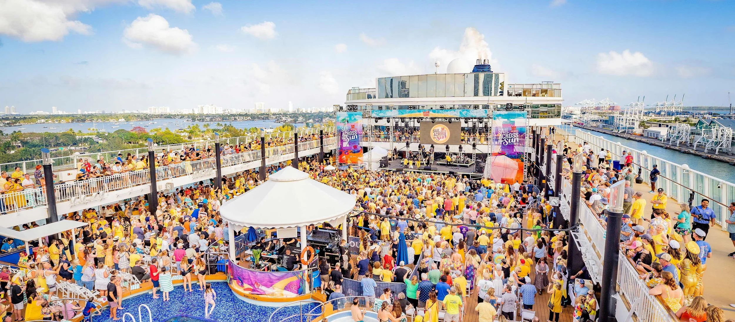
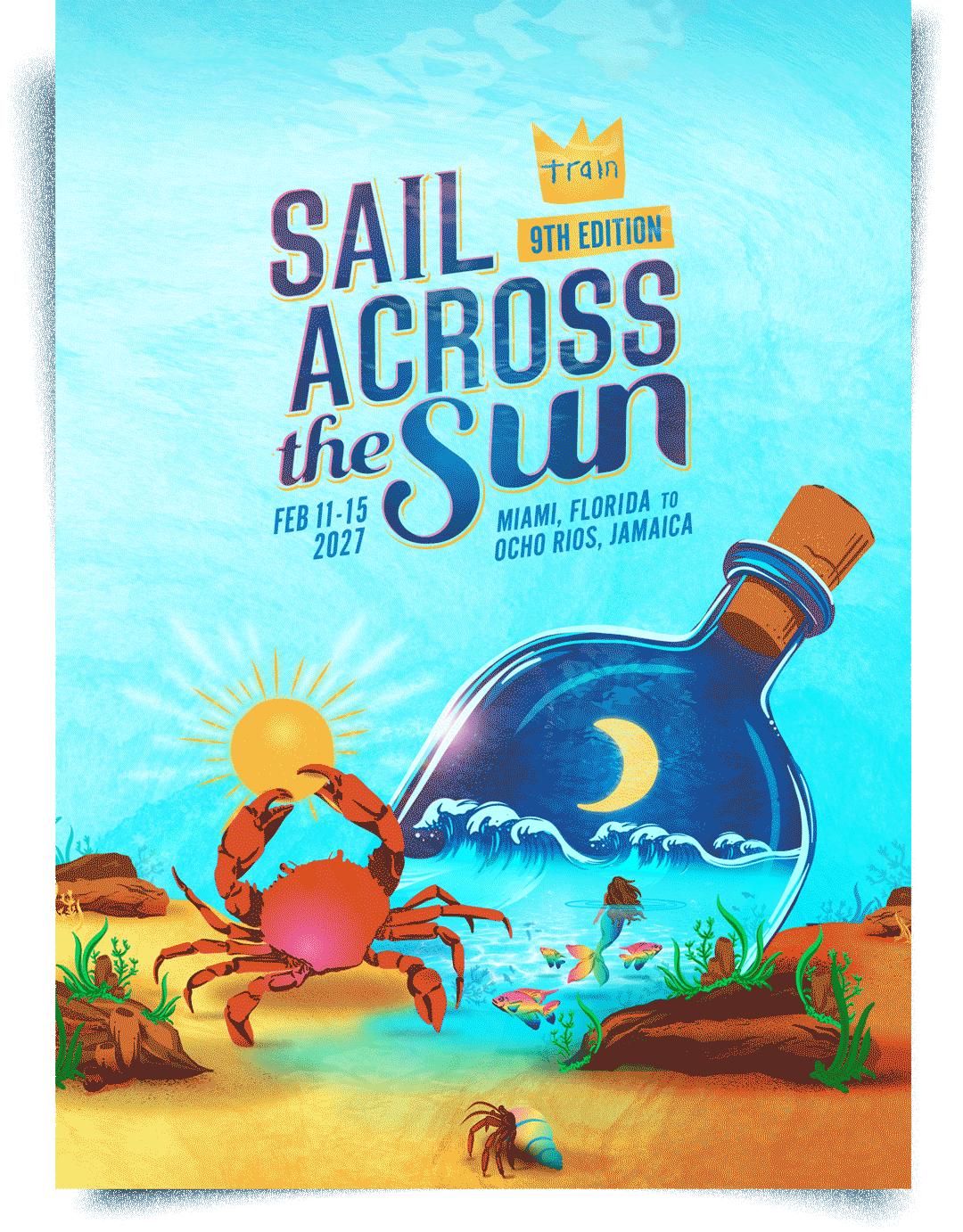
FESTIVAL IDENTITY CONCEPT
The 2027 Sail Across the Sun concept centers around a miniature universe in a bottle, an underwater dream of midnight waves, rainbow creatures, and magic between day and night. Building on the foundation established in our previous years' branding, we evolved the world we've been building together, adding new depth and dimension while staying true to the visual language fans have come to recognize and love.
DESIGN DEVELOPMENT
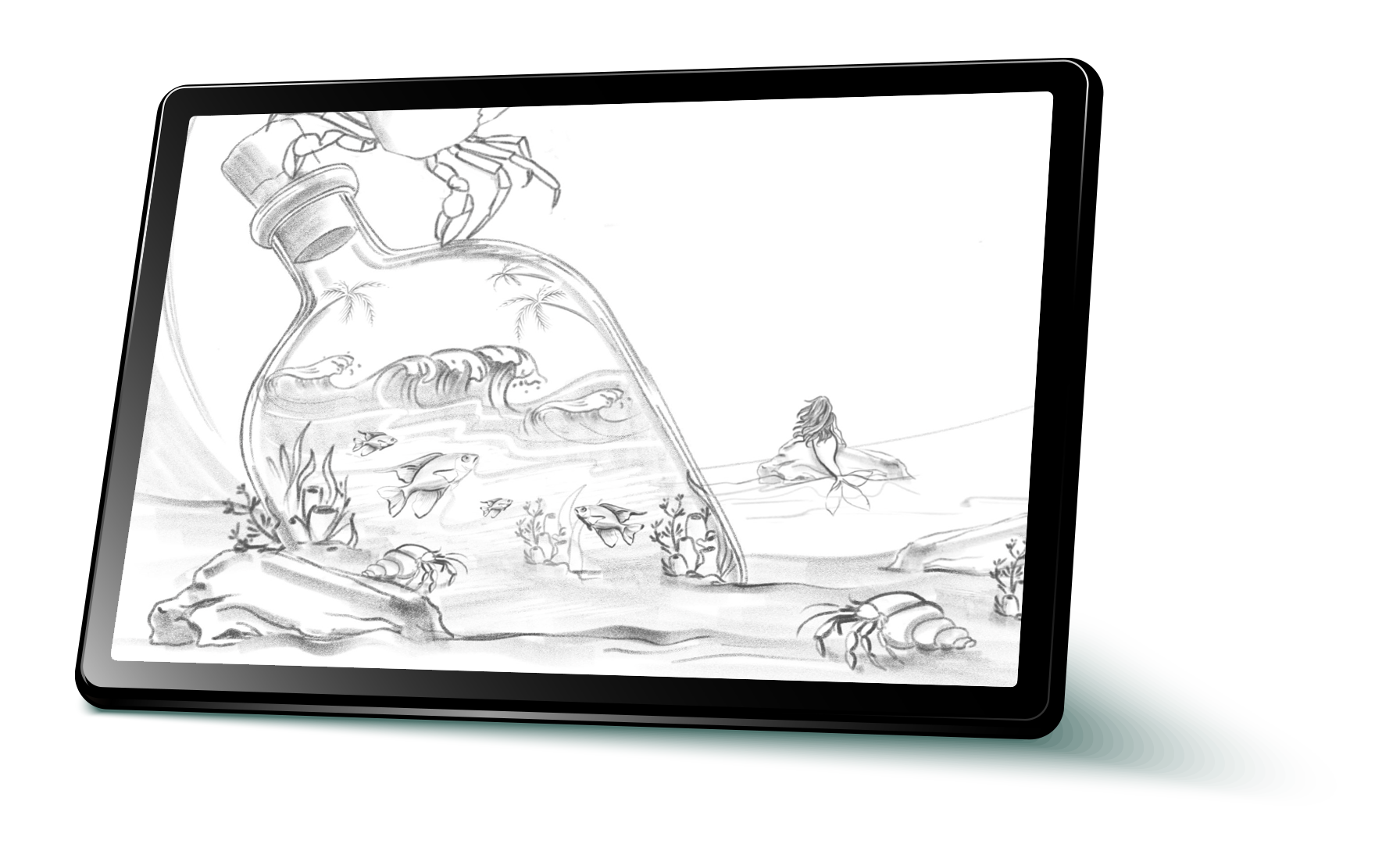
In developing the concept, we wanted the identity to feel like its own self-contained universe, mysterious, colorful, and full of discovery. Through sketching we worked out the concept composition, placing the "universe in a bottle" at the center and building out the surrounding underwater world of ocean, creatures, and coastal elements that bring the full scene to life.
ILLUSTRATION
All custom creatures and characters were sketched and vectorized in Adobe Fresco, then brought into Illustrator to colorize. Each custom illustration and supporting graphic was developed with careful choices around the color and texture to give every element depth, dimension and visual impact.
FINAL BRAND & STYLE GUIDE
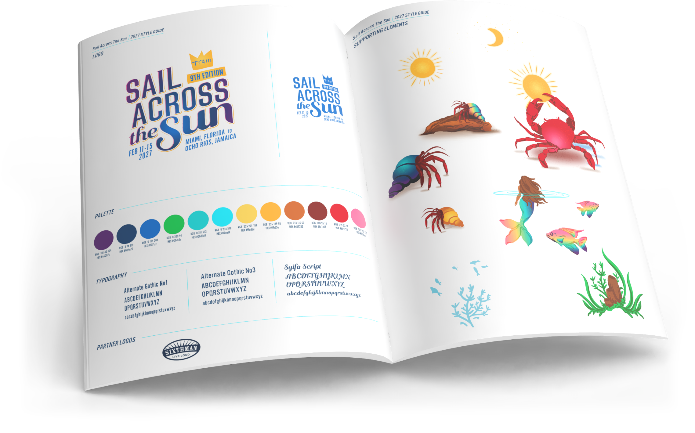
After finalizing the admat design we established a full toolkit of visual elements. The style guide serves as a reference tool, streamlining the content creation process for our clients by cohesively laying out logo usage guidelines, color palette, typography, supporting graphics and background elements. The effectiveness of this guide is at the forefront of our mind throughout the entire creative process, ensuring the identity works as hard as possible across every application.