
FESTIVAL IDENTITY CONCEPT
It was a privilege to create the modern graphics for Monterey Pop International’s 50th Year Celebration. Marking exactly 50 years later to the day and place of the legendary 1967 festival, Monterey Pop returned in June of 2017 to celebrate and we were honored to be a part of such a historic event in rock ‘n roll history. Thank you to our friends at Another Planet Entertainment for this opportunity!

DESIGN DEVELOPMENT
Using the original Monterey Pop artwork as inspiration and paying homage to the iconic poster art created by Tom Wilkes, our concept modernizes the lady of Monterey by creating her as an insignia that combines the female contour with the horns of the mythological god Pan, and is encapsulated with pulsating linework in the typical 60s fashion. The illustration gives her an updated and fresh look with flowers, grapevines and greenery adorning her.
The typography is hand drawn to flow and fit together, and through color and shadow gives it a contemporary feel while staying true to the classic designs of that era. Logo inspiration was pulled from the original festival ticket, where we then created hand drawn custom typography with a clean, stamped feel with segment lines to break up the information.
ILLUSTRATION & SCREEN PRINT
During the illustration process we created and built our insignia-based identity to work as a screen print, knowing that was a primary goal for the festival. We also designed this identity knowing we wanted to choose vibrant custom colors and paper to best support the screen printed poster as much as the digital and merch designs.

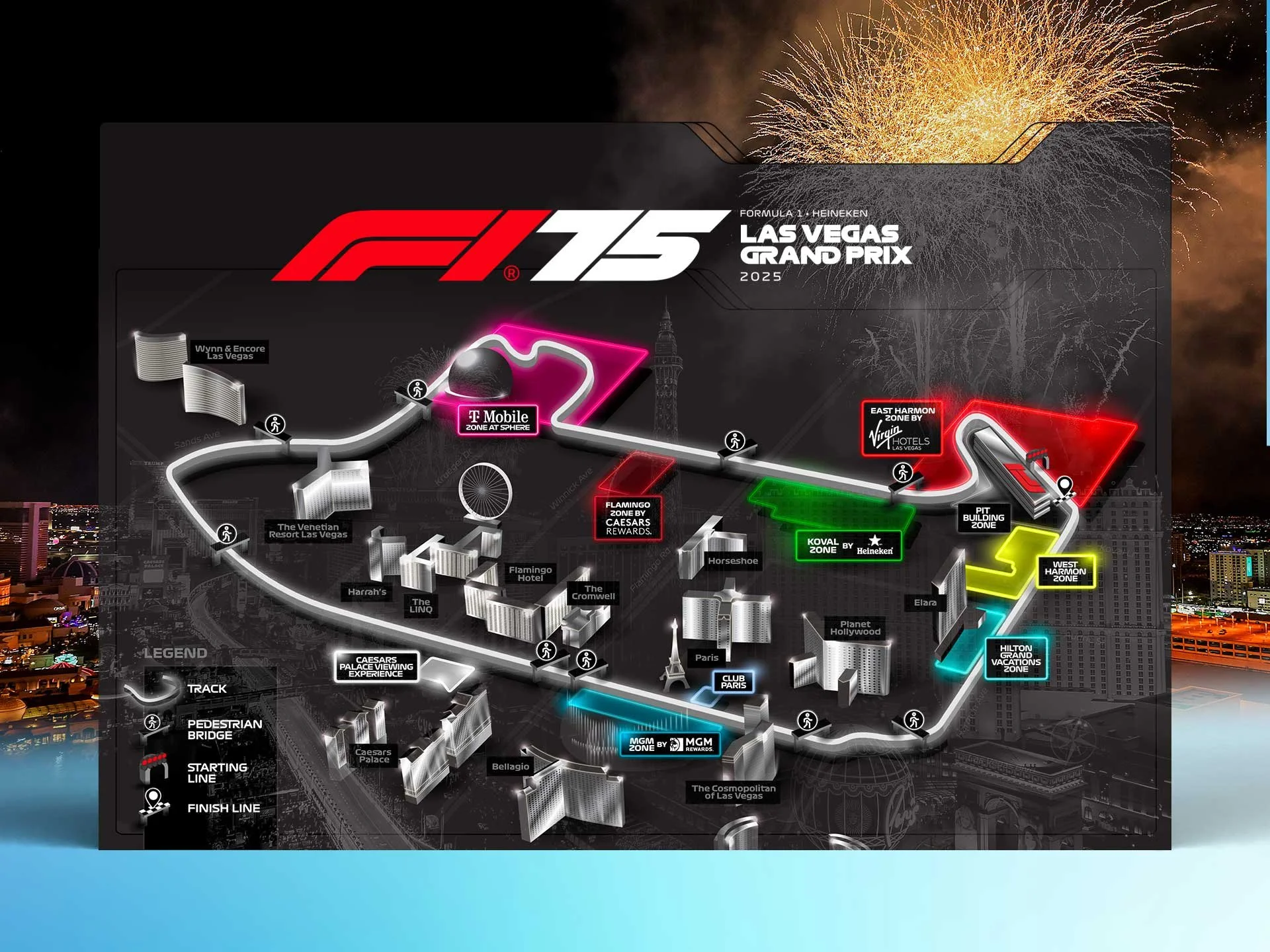
FESTIVAL SITE MAP
We created and designed the site map for the festival. The map is used across multiple applications from social media to the printed program guide.


MERCH DESIGNS
For Monterey we had the classic tagline to utilize in the merch designs, which was fun to highlight. Designing a festival merch mix is a creative and collaborative process that involves highlighting the brand while also understanding the target audience and the goal of making the designs appealing to the fans. Once designs are selected to finalize we weigh in on blanks and color combinations, going through rounds of revisions until we deliver final files to the printer.